Dithering, Reappearing
Scrolling through my social feeds recently, I noticed something interesting. I follow a lot of UI/UX accounts for fun and pick up inspiration from what they post, and lately I've started noticing dithering showing up in web and graphic work. Google Trends backs this up: interest in dithering has been climbing steadily over the past few years.
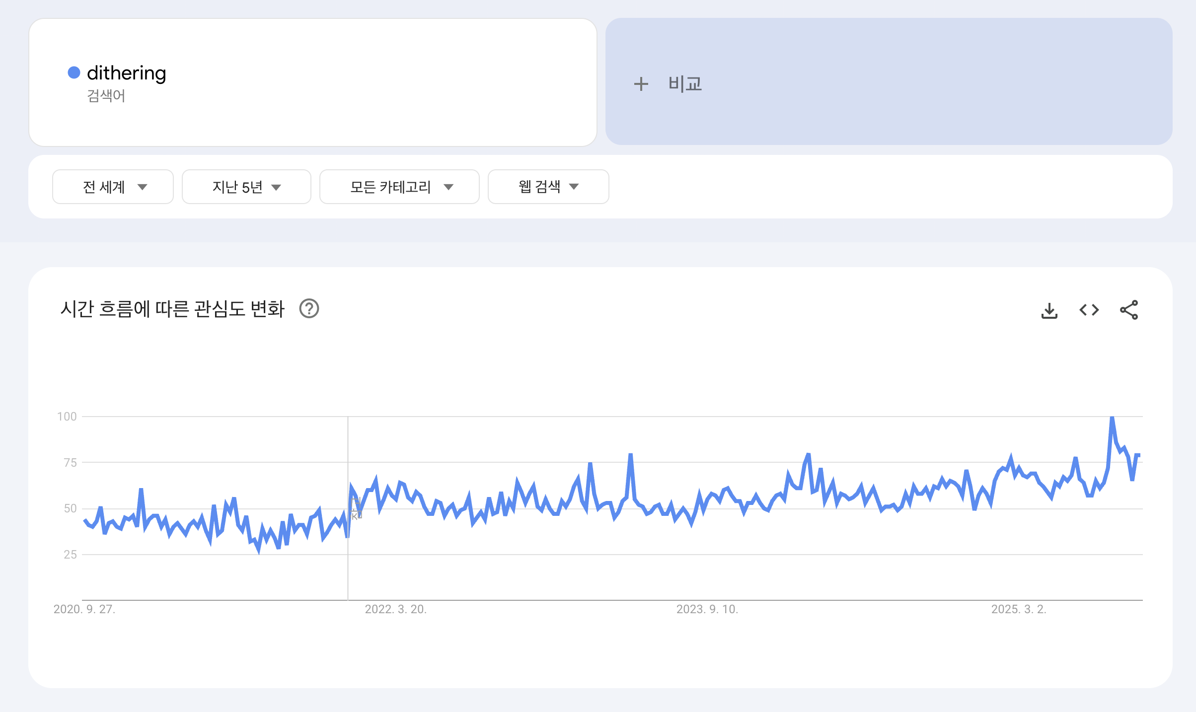 Google Trends from 2020 to 2025
Of course, polished, smooth graphics still dominate most feeds, so this is far from a mainstream shift by any objective measure. But articles like this one, which cover the broader retro trend including '80s synthwave aesthetics, suggest my hunch wasn't entirely off. I'd just zeroed in on one specific texture, dithering, that turned out to be part of a bigger wave.
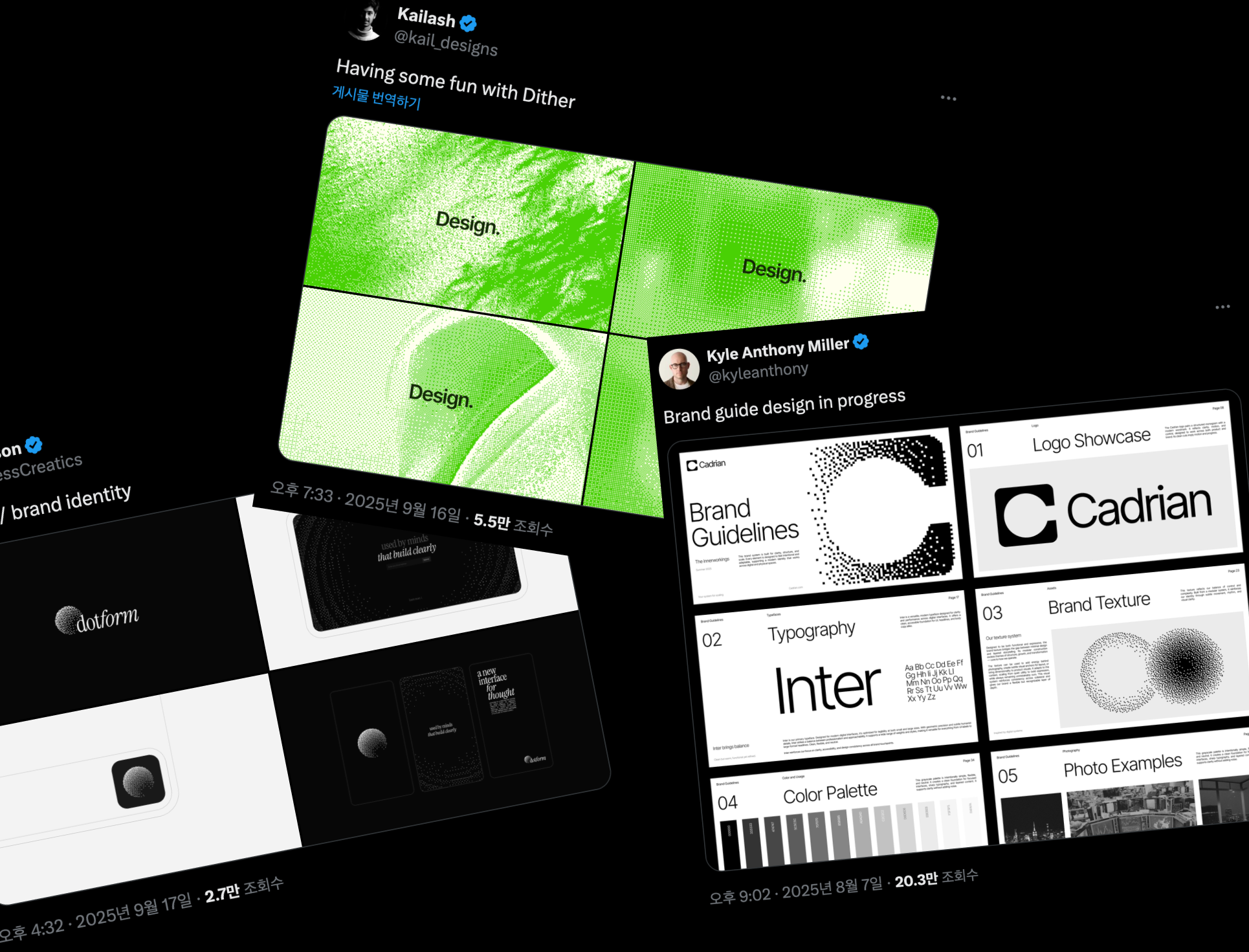 Dithering-flavored work that keeps showing up on X lately
At first I chalked it up to just another facet of the retro revival. But the more I thought about it, the more there seemed to be to unpack, and exploring dithering's characteristics further felt like it could turn into something worth sharing. So I decided to write this.
What Is Dithering, Exactly?
So what is dithering? Wikipedia defines it as a technique for representing shading or color using a limited palette. In plain terms: it's a trick that mixes pixels together to simulate a wider range of colors than are actually available.
When real-world color is translated into digital form, the number of representable colors inevitably shrinks, in a process called quantization. Dithering's job is to smooth over the visual artifacts that quantization produces, like banding (where color groups split into visible stripes), so the result still looks natural.
Remember classic games limited to 16 or 256 colors? By placing pixels almost like pointillist brushstrokes, dithering let those games convey rich color and a surprising sense of depth even on a limited palette. It's still used today, too, including for intentional visual effects and 3D optimization in modern games.
Interestingly, dithering is still part of our everyday lives now that color reproduction is essentially unconstrained. The GIFs we laugh at and share on messengers and forums are a good example. GIF only supports up to 256 colors, so converting video into GIF requires reducing the color palette while applying dithering at the same time, or the result looks unnatural.
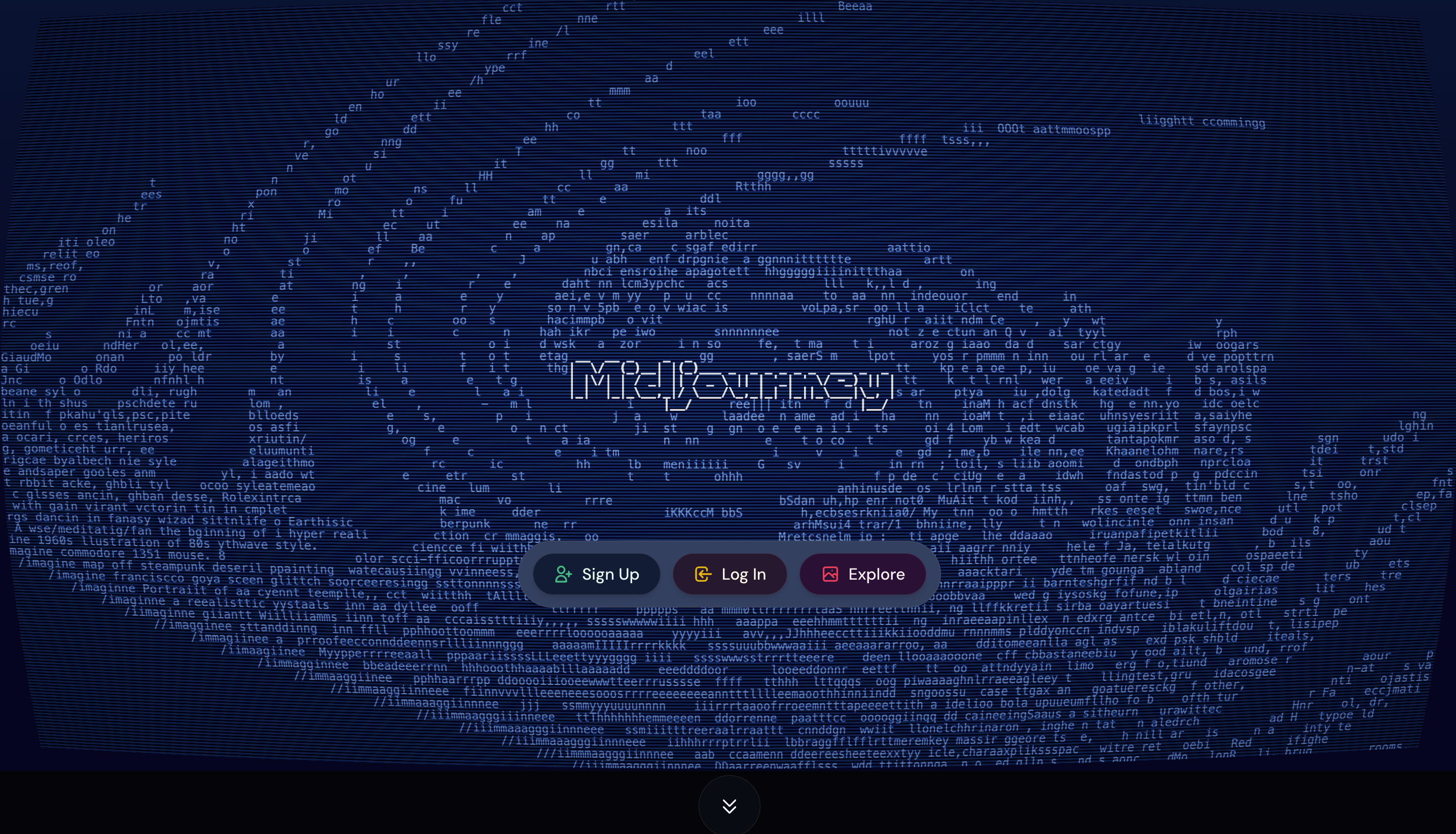 Midjourney's homepage
Lately, ASCII art has also become common, and it shares something with dithering: both use density and contrast of discrete units (characters, in this case) to represent an image. It's not technically dithering, but more a stylistic technique that borrows dithering's underlying principle.
Dithering Techniques
Now that we've covered the concept, let's look at the actual techniques used to produce dithering. There are several algorithms, broadly grouped into average (threshold) dithering, ordered dithering, and error-diffusion dithering.
I've prepared a sample image. To make the principle easier to follow, I'll first convert it to grayscale, then apply each dithering technique to that grayscale base.
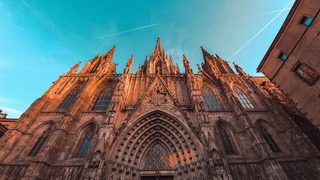 Original (640x360) / Miltiadis Fragkidis on Unsplash
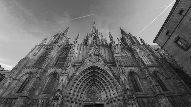 Grayscale (640x360) / Miltiadis Fragkidis on Unsplash
For consistency, let's fix the number of color levels at 10 across all three techniques, meaning the 0–255 color range is divided into 10 levels, simulating a color-constrained environment.
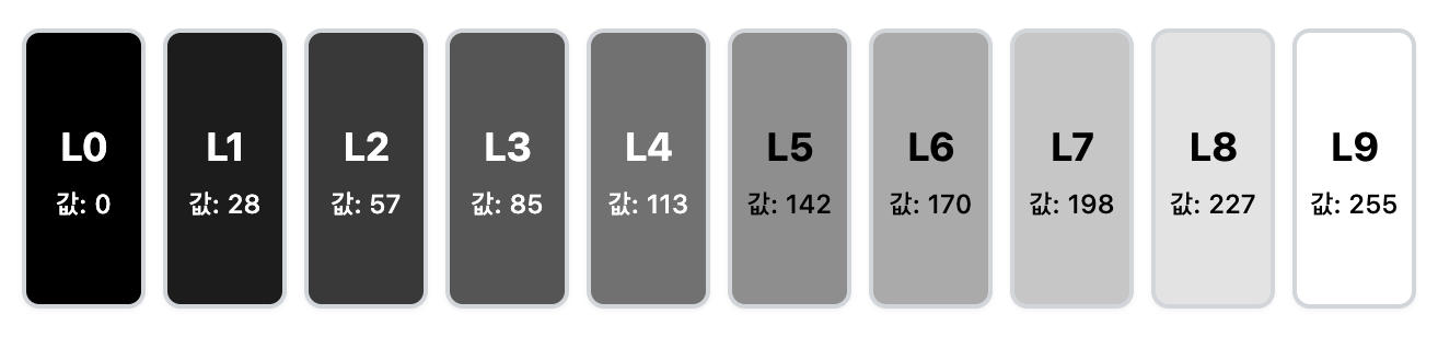 A 10-level color scale
Average (Threshold) Dithering
The simplest method compares each pixel's brightness or color value against a fixed threshold, converting it to one color if it's above the threshold and another color if it's below. This is fast and simple to compute, but it tends to reveal a regular, blocky pattern and produce coarse tonal gradation (the range of shades from the darkest to the lightest part of the image), which hurts overall quality.
Average dithering works like this:
- Divide the image into pixel blocks. The block size determines how smooth the overall image looks.
 An example using 2x2 blocks
 - Check the color values of the pixels within each block.
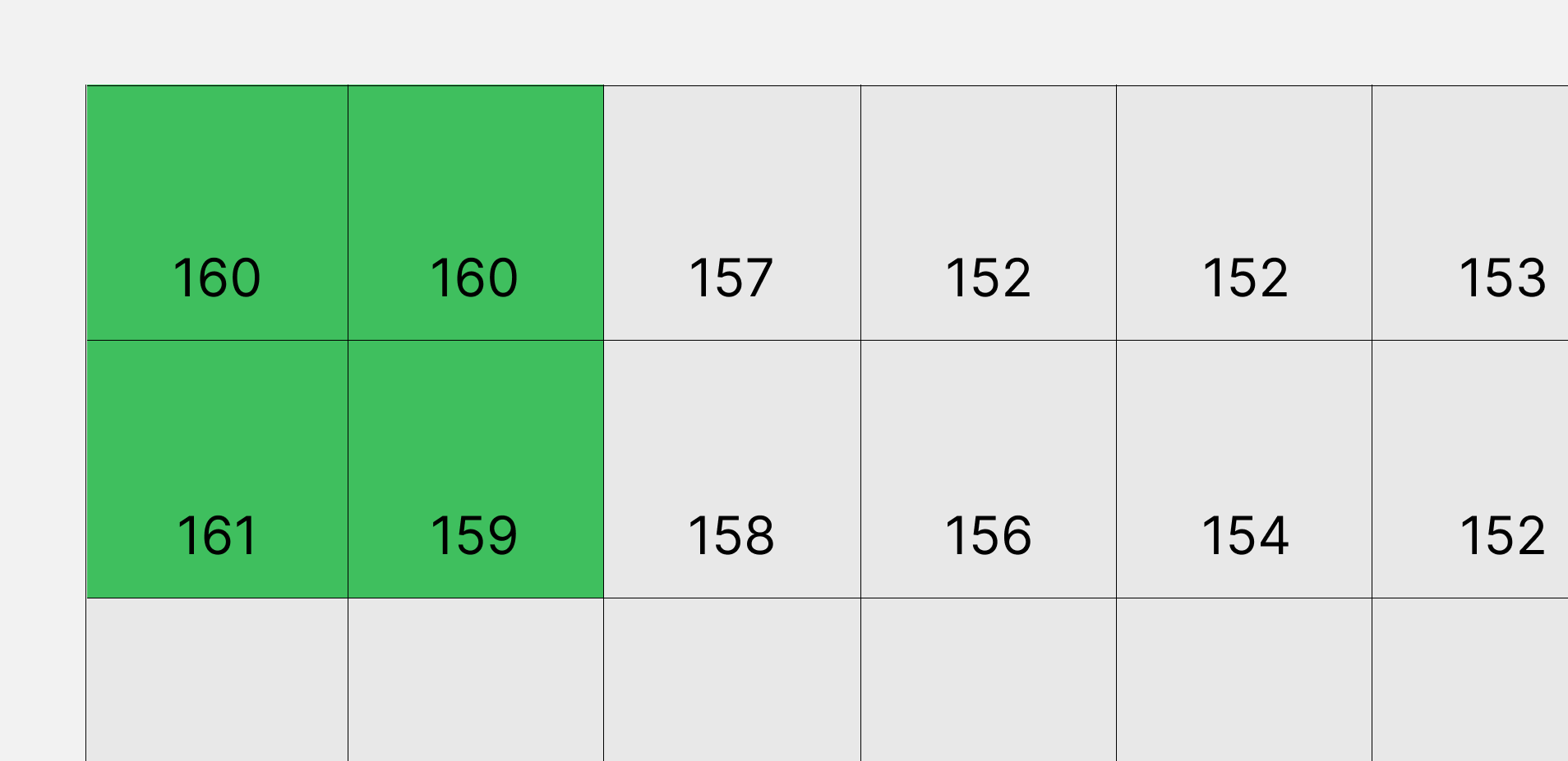
- Compute the average value of the pixels in each block.
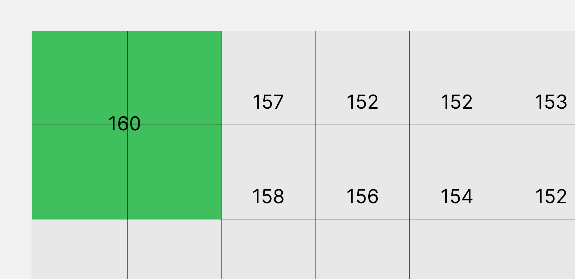
- Convert that average to the nearest of the 10 color levels, and repeat for every remaining block.
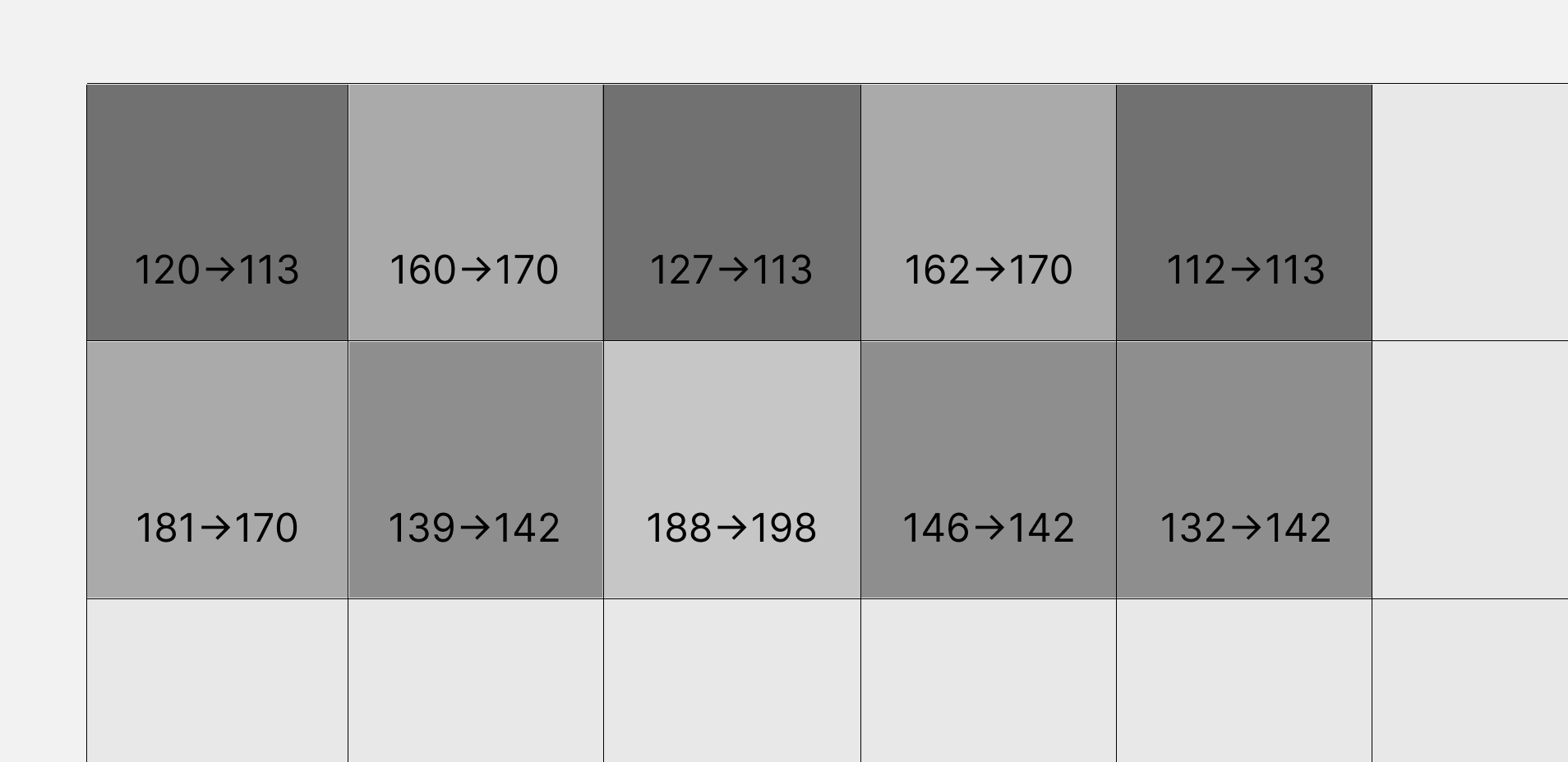
Here's the result of applying this process. The number of colors used has clearly dropped, but the output looks too coarse.
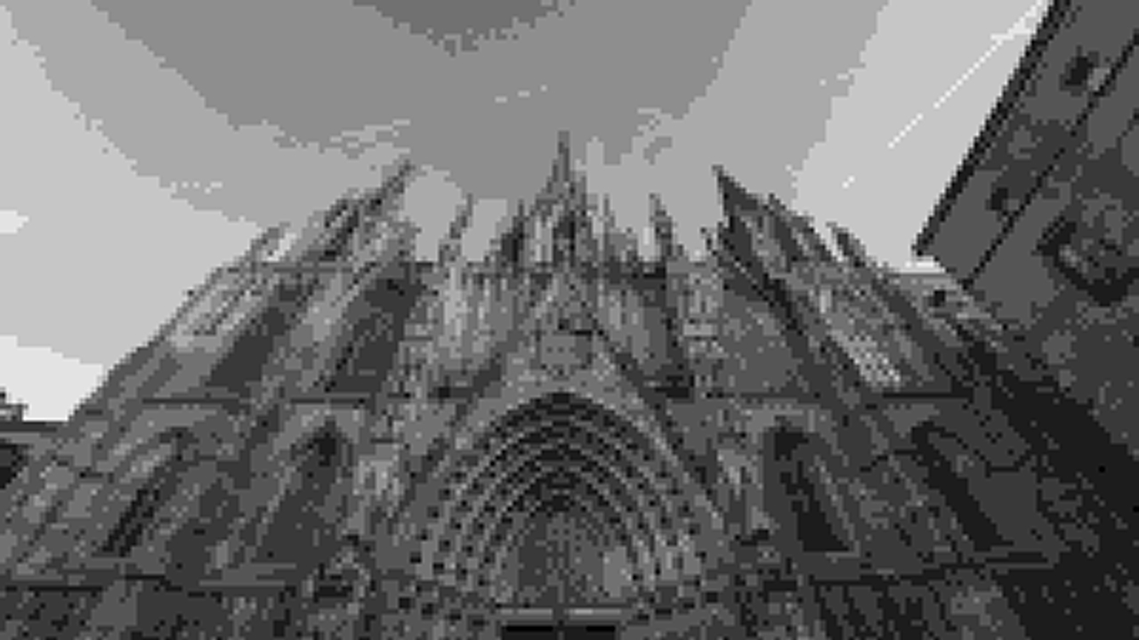 2x2 pixel blocks
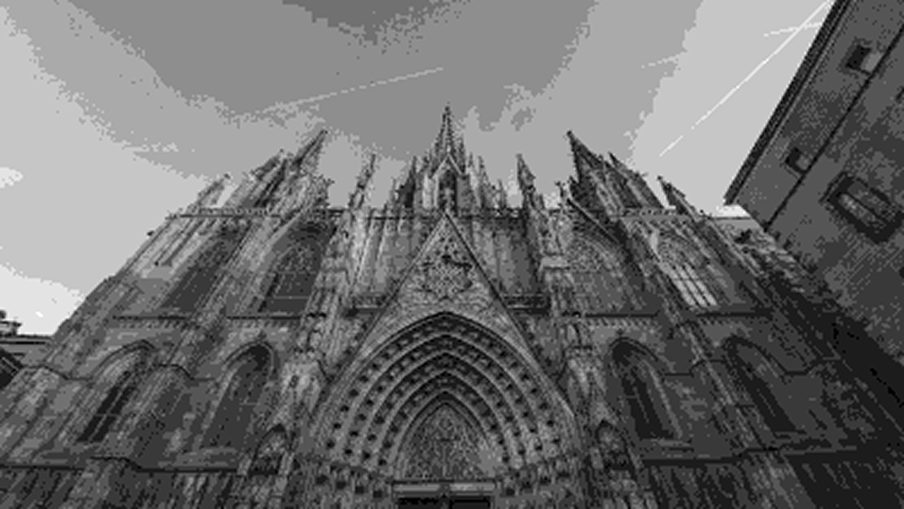 1x1 pixel blocks
Ordered Dithering
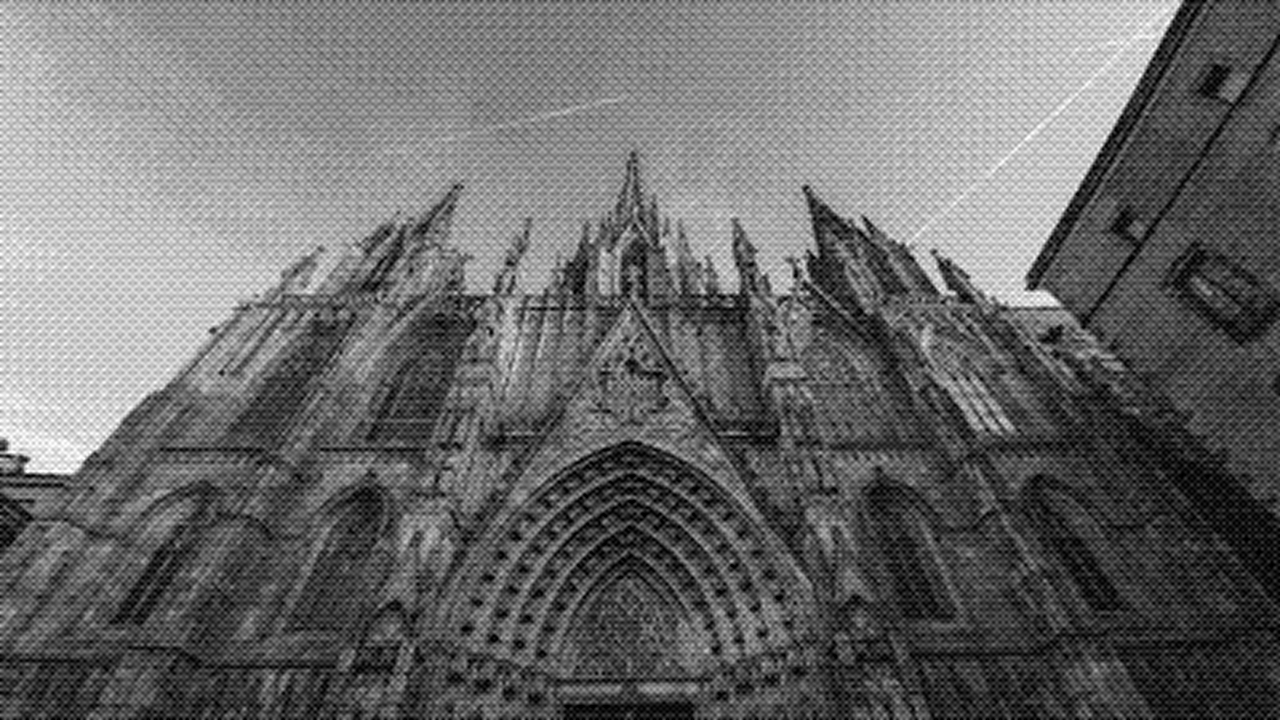
Ordered dithering addresses the limitations of threshold dithering by applying a different threshold to each pixel, based on a fixed pattern, typically a "Bayer matrix." This produces a more regular pattern that improves tonal gradation, delivering noticeably better quality than simple threshold dithering while computing faster than error-diffusion dithering. The trade-off is that the pattern itself can become visually noticeable, and the result looks less natural than error diffusion.
Before walking through the process, a quick note on the Bayer matrix: it's a 4×4 numeric pattern developed by Bryce Bayer in 1973. The numbers 0 through 15 look almost randomly arranged, but they're actually the result of extensive experimentation to find a visually optimal, natural-looking combination. Ordered dithering with a Bayer matrix uses this pattern to render natural-looking midtones.
4×4 Bayer matrix (for reference)
| 0 | 8 | 2 | 10 |
| 12 | 4 | 14 | 6 |
| 3 | 11 | 1 | 9 |
| 15 | 7 | 13 | 5 |
- Check each pixel's individual color value.
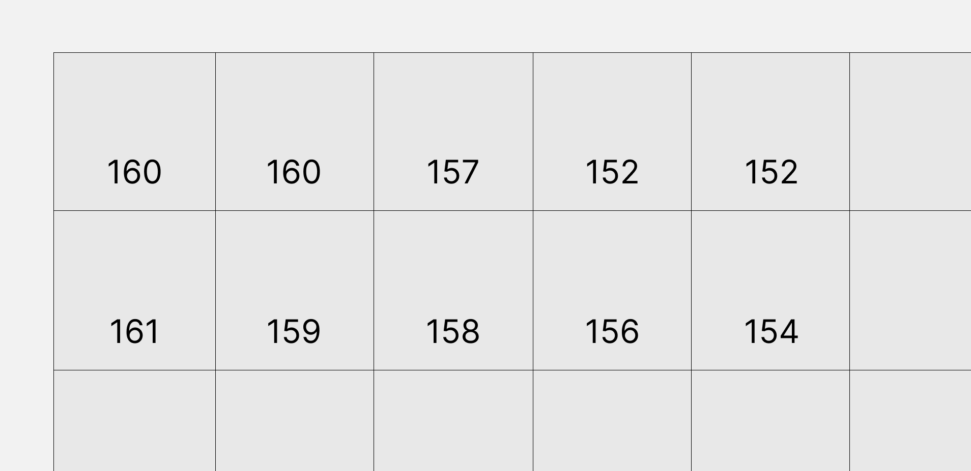
- Map the corresponding Bayer value to each pixel position.
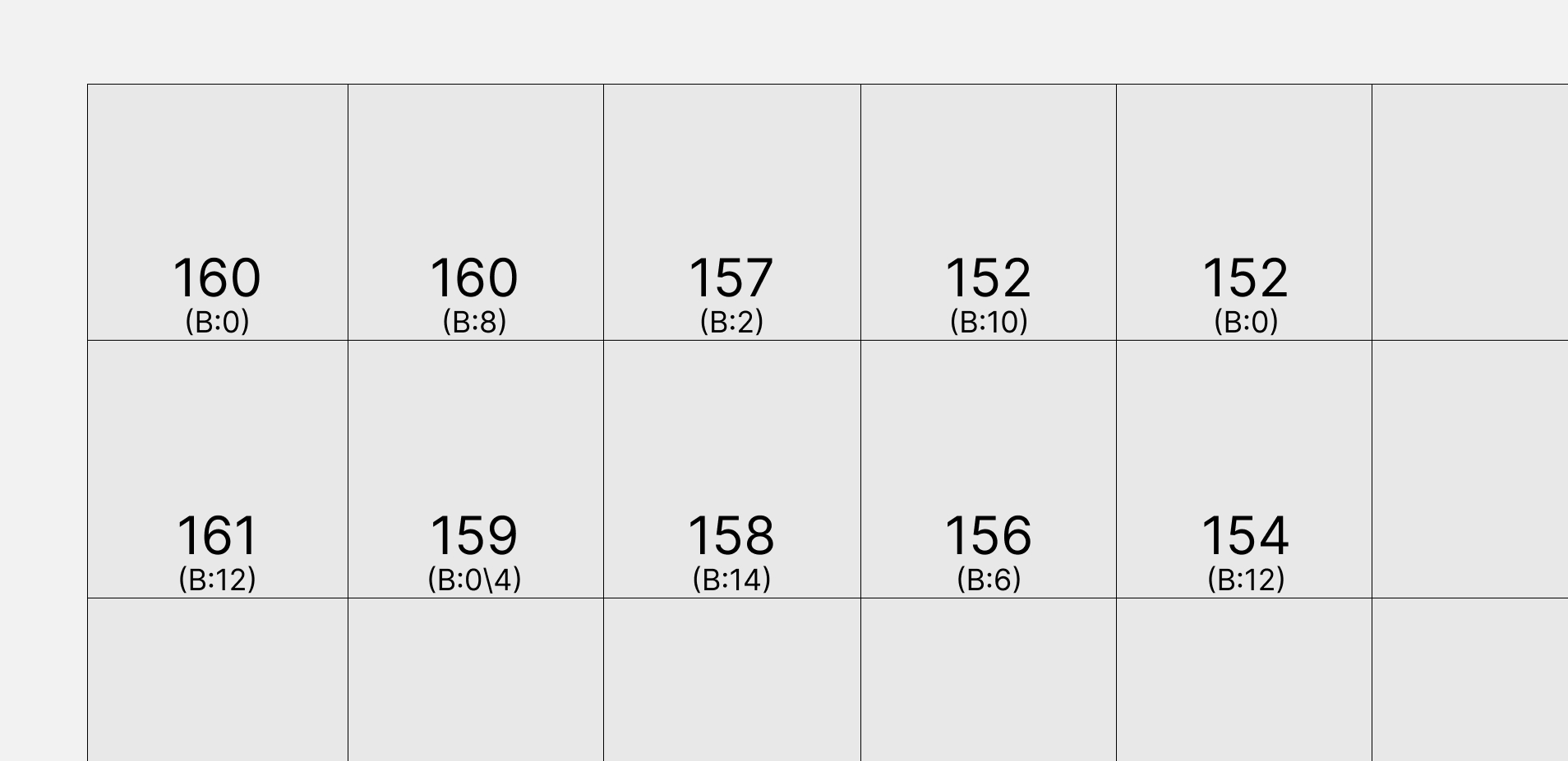
- Generate noise from the Bayer values and apply it to the original.
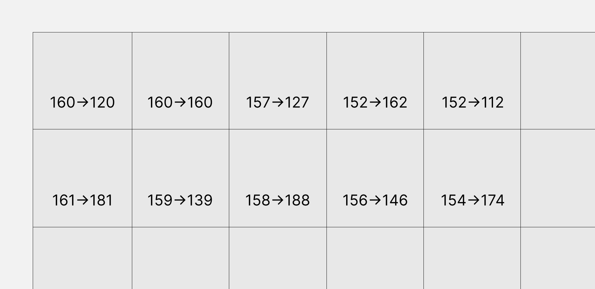
- Convert the adjusted values to the 10 color levels.
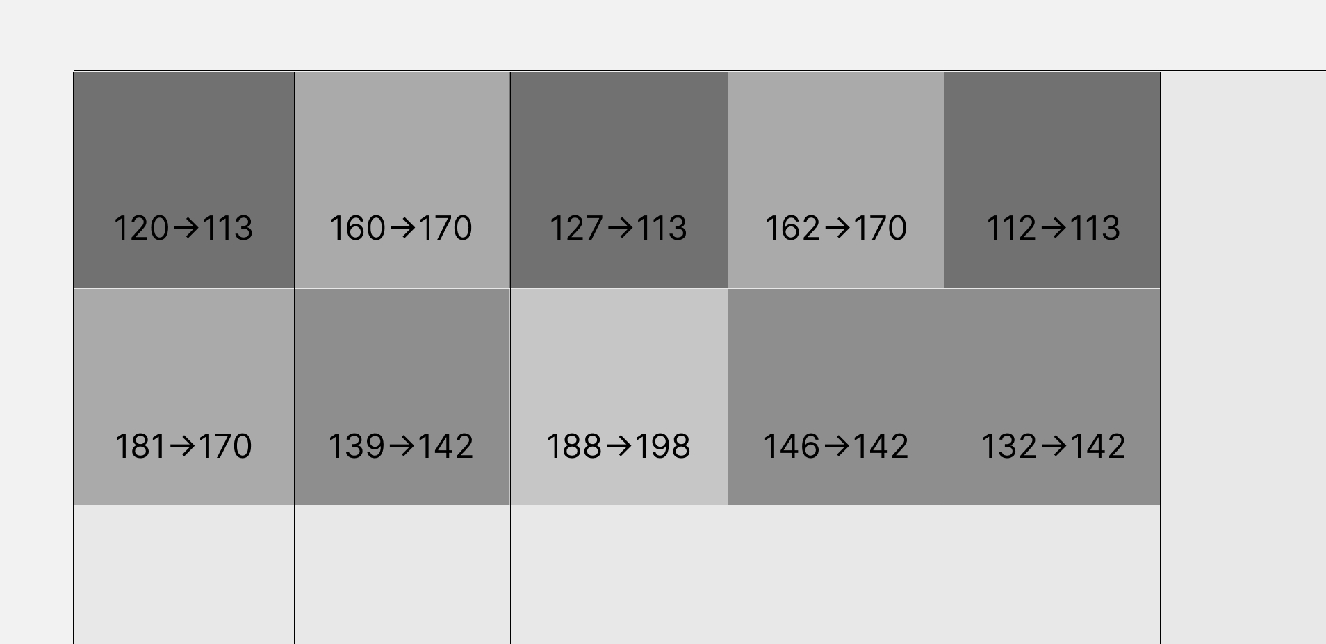
By adding a noise-intensity value on top of the base Bayer value, you can dial in the amount of texture you want. Here's the result:
Error-Diffusion Dithering
Error-diffusion dithering calculates the quantization error produced when converting a pixel's color, and spreads that error to neighboring pixels that haven't been processed yet, correcting their values and improving overall image quality. The best-known example is the Floyd–Steinberg algorithm, which renders continuous tonal gradients the most naturally of the three techniques and produces the least artificial-looking regular patterns. The downside is that it's slower to compute, since it depends on the values of surrounding pixels.
Let's walk through the process using the Floyd–Steinberg algorithm. In this method, the error from each pixel is distributed to four neighboring pixels, following this pattern:
| current pixel | 7/16 | |
| 3/16 | 5/16 | 1/16 |
- Process the image sequentially from top-left to bottom-right. Each row proceeds left to right, and pixels already processed are never revisited.
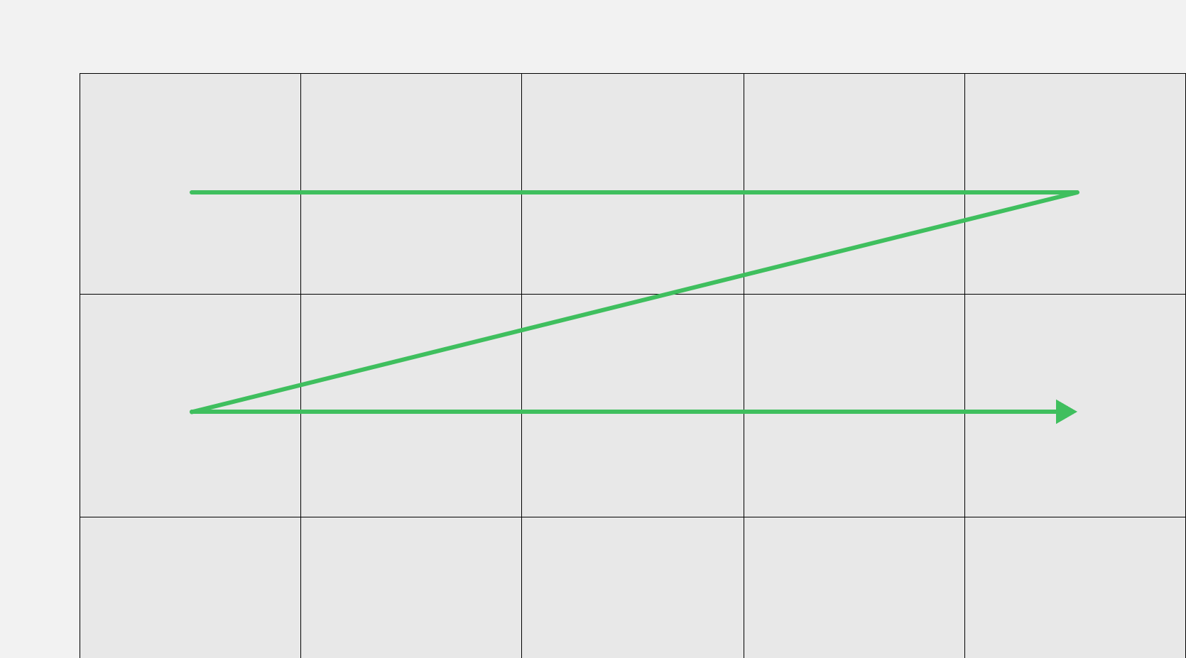
- Add the accumulated error carried over from previous pixels to the current pixel's grayscale value (0–255). Convert this adjusted value to the nearest of the 10 color levels.
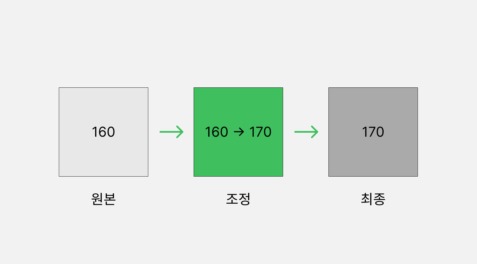
- Calculate the difference produced during quantization as the error.
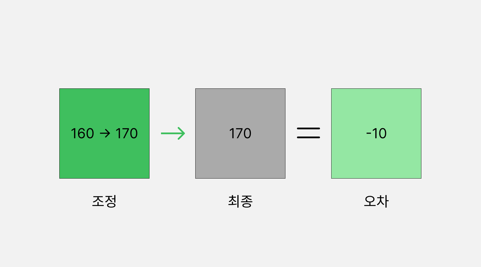
- Distribute the calculated error to the four neighboring unprocessed pixels according to the fixed ratios.

- At the edges of the image, there may be no pixel to diffuse the error into. In that case, the difference is small enough to simply drop.

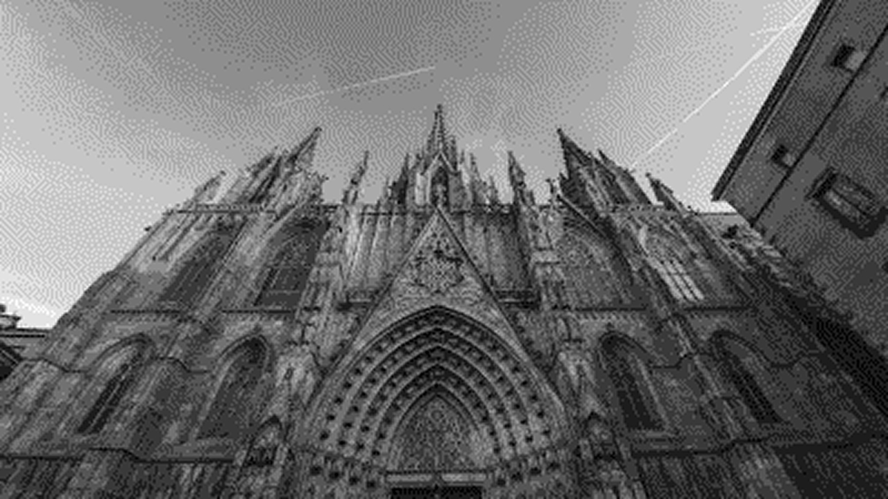
Here's the result of applying this technique. Compared to the previous two methods, the pattern is noticeably less visible and the result looks distinctly more natural.
So Why Dithering, Now?
Coming back to where I started: why is dithering showing up so much in design lately? We live in an era with essentially no technical constraints on color, so it's hard to explain as a technical necessity. If it's intentional, it's likely because designers are drawing on what dithering represents: a feeling, a symbol. And what dithering can express doesn't feel unrelated to the character of this particular moment.
First, an age of noise.
Generative AI produces its output through noise. Tools like Stable Diffusion and Midjourney start from random noise and progressively refine it into an image. Noise plays an equally essential role in dithering. In that sense, noise feels like a fitting symbol for the AI era.
Second, dithering blurs boundaries.
At its core, dithering is a technique for blurring edges and rendering form with a sense of depth. Instead of sharp dividing lines, it creates gradual transitions. And right now, we're living through an era where boundaries everywhere are blurring: between the digital and the physical, between humans and AI, between developers and designers. Dithering feels like an apt metaphor for that kind of transition, or for the services that help us navigate it.
Third, a longing for imperfection.
Maybe in an age where everything is 4K, 8K, and nearly unconstrained in how sharply it can be rendered, a kind of nostalgia emerges precisely from imperfection and limitation. Amid AI-generated images with their distinctively glossy sheen, imperfect and rough images stand out all the more. It seems to touch something in us: a desire to give AI its due place while still holding on to what feels distinctly human. Dithering might just be a good symbol for that human longing for imperfection.
A Dithered Kind of Person
Out of curiosity, I looked up the word "dither" itself: it means to hesitate, to be nervous or indecisive. With everyone talking about how much AI is about to replace, and the economy apparently worse off than during the IMF crisis, I suspect a lot of people are carrying around a small "dither" of their own these days.
Having crossed over from design into development myself, I spent much of my early career asking, "Am I a designer, or a developer?" Back when the two roles were drawn more sharply, that ambiguity felt even more disorienting to my sense of identity.
These days I see that ambiguity differently. Just as dithering produces richer expression from a limited palette, moving back and forth between design thinking and engineering implementation is, I think, exactly what let me develop my own perspective and my own way of working.
I still have plenty of room to grow, of course. But like a pointillist painter completing a whole picture one dot at a time, I feel like I'm building my own body of work through that same dot-by-dot process. In that sense, I might describe myself as a dithered kind of person.
Closing
That turned into a bigger journey than I expected, starting from a trend I noticed online, working through what dithering actually is and how it's produced, and ending up reflecting on myself.
It reminds me of something I saw recently: a video featuring Professor Dae-Sik Kim from KAIST. Asked what we should prepare for as AGI approaches, he gave an answer that struck me as almost unsettling:
"For the next five to ten years, work through your bucket list."
That sounds like it's describing a change so large we can barely imagine it, as if the world we've known so far is about to end. And yet, ten years from now, won't I still be living as myself, facing questions that are different but also strangely familiar?
Even as the world changes, I hope to live a life where what I make, like dithering bridging two extremes, helps solve problems, fills the world with a little more care, and contributes to a better everyday life for someone. On that note, I'll close this one out.
References
https://en.wikipedia.org/wiki/Dither
https://en.wikipedia.org/wiki/Ordered_dithering
https://en.wikipedia.org/wiki/Error_diffusion
https://hbyacademic.medium.com/how-to-deceive-your-eyes-image-dithering-172966d372b0
https://www.leadtools.com/help/sdk/v20/dh/to/introduction-color-resolution-and-dithering.html
Average Dithering / VISGRAF LAB, IMPA
Ordered Dithering / VISGRAF LAB, IMPA
Error Diffusion Dithering / VISGRAF LAB, IMPA
Zigbang Tech Blog: Building a Dither Transparency Shader (Korean)