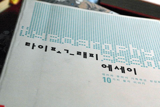
This is Typography Essays by Erik Spiekermann & E.M. Ginger.
A while back I watched the documentary Helvetica, and it made me realize how little I actually knew about typography. That's how I ended up finding this book.
You might sense it faintly from the word "essays" in the title, but even though it covers some pretty technical material, it's genuinely fun to read.
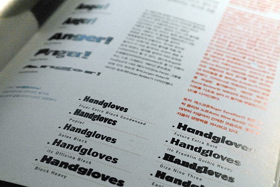
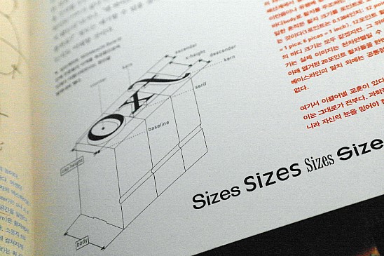
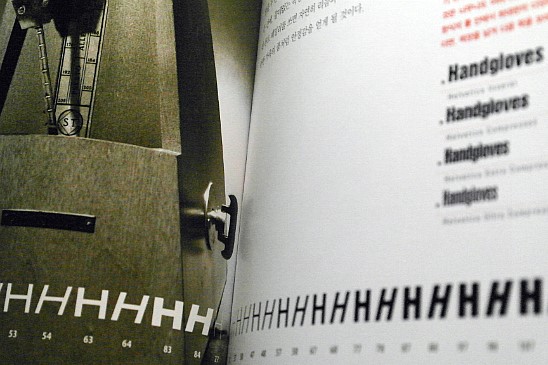
To keep things from getting dull, every chapter fills the left-hand page with images, while the right-hand page is laid out around whatever topic is at hand.
Countless typefaces get introduced, one situation at a time.
The writing isn't stiff or formal at all; the casual tone and all the little analogies make the content much easier to read and remember.
Since it's a foreign book, most of the explanations focus on English typography, but the hard-won advice drawn from real practice still feels plenty useful.
In fact, professionals pour an enormous amount of time and effort into finishing off the kind of details that ordinary eyes will never even notice. p.17
Good designers learn all the rules before they break them. p.40
Finding the compromise between the practical and the aesthetic, that is design itself. p.61
Good tools alone aren't enough to create visually excellent communication. p.153
Typography Essays