I heard a story recently that was funny and sad at the same time. A freelance web designer apparently built a website using Naver's Nanum Gothic typeface. When she showed it to the client, the feedback she got back was: "I'm not really loving the font. What if we used one of Naver's own fonts instead?" I can only imagine how that landed with her. There's no way to verify whether this story is true, but it does feel like people have never cared this much about fonts, enough to have real opinions about them, than they do right now. Maybe it's because so many different typefaces are now used to catch people's attention across all kinds of media, each suited to its own platform. Or maybe it's simply that more people are choosing and using fonts themselves, as producers, whether it's making a presentation at school or at work.
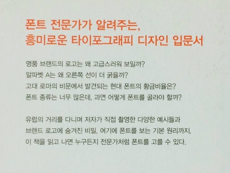
As more fonts get made and more people use them, one question keeps coming up: which font should I actually use? Add English typefaces into the mix and the possibilities multiply many times over. Designers trained in typography can usually pick a font with confidence, working from their own criteria and knowledge, but as fonts became more accessible, a lot of font users showed up without much grounding in typography at all. This book is for them. Akira Kobayashi's The Secret of Fonts, as he states in his own foreword, was written to help people who are stuck wondering which font to choose out of the many available.
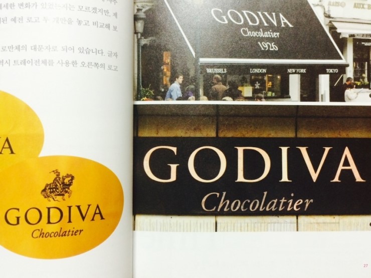
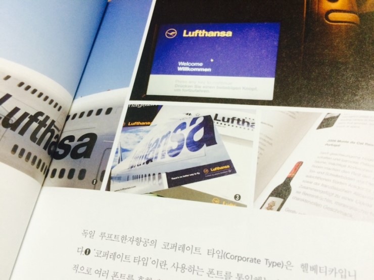
As a young man, Akira Kobayashi decided he needed to learn the fundamentals of Roman type, so despite shaky English and not much money, he bought a one-way ticket to London. The year and a half that followed was filled with calligraphy classes at a night school and long hours of self-study in the library. That devotion eventually earned him two Grand Prix wins at a world-renowned type design competition and a position as type director at Monotype. This book carries that same raw passion for Roman typefaces, born from what must have been a difficult leap of faith, and lays it out with a kind of care that feels distinctly Japanese.
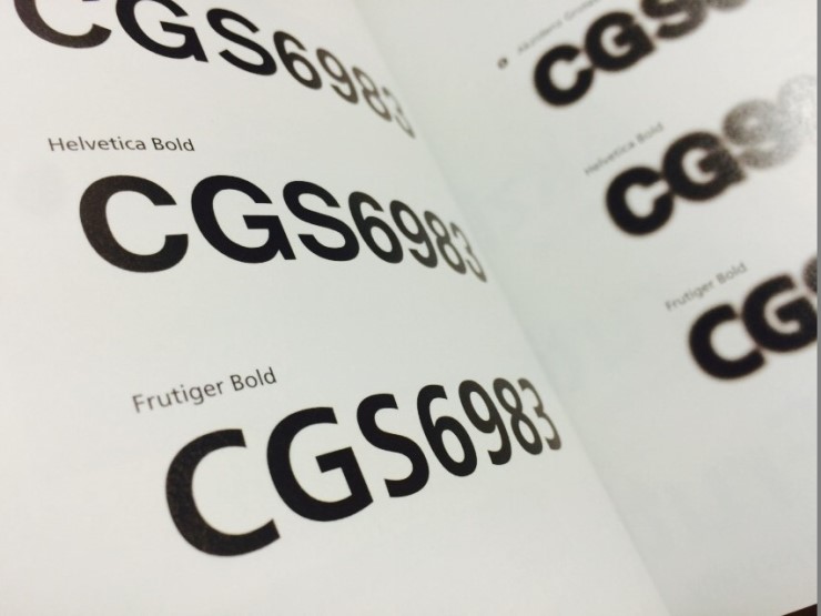
The Secret of Fonts is a journey through the world of type with Kobayashi as your friendly guide. From the logos of brands we run into every day, to fonts he spotted on the streets of Europe, to extra explanations for readers who want a bit more, he walks through all of it, pointing to photos he took himself while traveling the world, introducing sixty seven fonts in a way that's easy and genuinely fun to read. It skips technical terms like x-height that usually show up in typography books, which makes it a great entry point for anyone just starting to learn about type design.
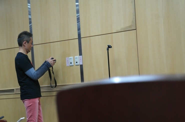
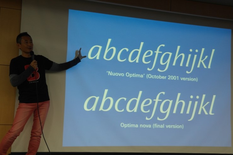
Last September I attended a seminar Kobayashi gave with Typography Seoul. He was lighthearted and deeply serious at the same time, all the way through the talk. Before the seminar even started, I watched him photograph the lettering on a fire hydrant tucked in a corner of the room, and I could see right there how much curiosity and passion he has for type. It's not in the book, but throughout the seminar he kept emphasizing the importance of developing an eye for form. What he meant, essentially, is that the black letterforms we think of as fonts only exist because of the white space around them. Good font design happens when that white space is distributed well. To train that eye, he suggested looking at words as whole units rather than letter by letter. Keeping that in mind while reading the book helps a lot with understanding fonts.
According to Marcel Proust, "the real voyage of discovery consists not in seeking new landscapes, but in having new eyes." By that measure, The Secret of Fonts genuinely counts as a journey. It gives you new eyes for the countless fonts you've walked past without noticing, day after day. I can say with confidence that after reading this book, the Louis Vuitton logo or the signage at Incheon Airport will never look quite the same again. If you're planning a trip this winter, bring this book along and take two journeys at once. And if you don't have the time or money to travel right now, don't worry, you don't need to.
The Secret of Fonts